Stony Man Coffee’s Original Menu
Initial Thoughts
Prices aren’t clear
Choose 2-3 fonts
If flavors are the same on different drinks, (or you add them after) combine area to save menu space
If you want to sell a drink like
“Cinnamon Bun Cold Brew” Possibly, push one flavor a day? Maybe with a sale?Consistent drink sizes
Choose 2-3 colors
“Choice of Milk and Flavoring”
not necessaryDonuts makes it seem like you sell full donuts. I would just advertise as “Donut holes (or rounds, I prefer rounds).
Under “Hot Donuts”, just put “2”, customers can always double up if they want only want 1 flavor
Stony Man Menu Re-Design


Colors
• Dark Brown was chosen to convey the organic freshness and earthiness of the coffee beans
• Orange was chosen for font conveying creativity, energy, and enthusiasm
Both seemed appropriate
All colors are web accessibility contrast compliant with each other
Fonts
Montserrat and Lobster pair nicely together and give the menu a clean look, that makes it easy to read. Classic, local, and fun look.
Other Graphics
“Small Batch and Local” Maryland stamps were drawn by myself
More Promotional Work for Stony Man Coffee


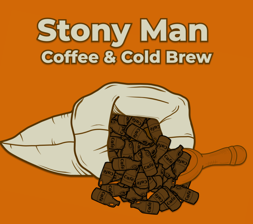
The idea was to make a burlap sack over with coffee bean/growlers spilling out of it. Original designs looked like Coca-Cola bottles, had to do some tweaks to get the growlers looking like coffee beans.


Read more about Stony Man Coffee in a case study I did with them

